Checkboxes may be switched independently of each other, while radio buttons are part of a group where only one may be active at a time.
Mutual exclusion
Suppose you open a new application and see something like this:
Try clicking on these radio buttons. You should find that this “application” can walk, and it can chew gum, but not both at the same time.
Independence
What if you later upgrade to version 2.0 of the same application, and see this:
Try clicking on these checkboxes. You should find that the “application” can now walk while chewing gum.
Visual cues
Did you see square checkboxes and round radio buttons? This user interface convention is common across many different platforms. It is worth learning to recognise it.

Checkboxes in Windows Classic, Windows Aero, Mac OS and iOS Safari

Radio buttons in Windows Classic, Windows Aero, Mac OS and iOS Safari
Indeterminate checkboxes
Sometimes a checkbox has to display the state of a group of items, some “off” and some “on”. While checkboxes may have a common shape, this is not consistent between platforms.

Checkbox states in Windows Classic, Windows Aero and Mac OS
Clicking on an indeterminate checkbox will usually start switching it between its “on” and “off” states. You may not be able to restore it to its original state ((The Windows file properties box does allow you to cycle back to the indeterminate state, but don’t count on this happening elsewhere.)).
Dependent checkboxes
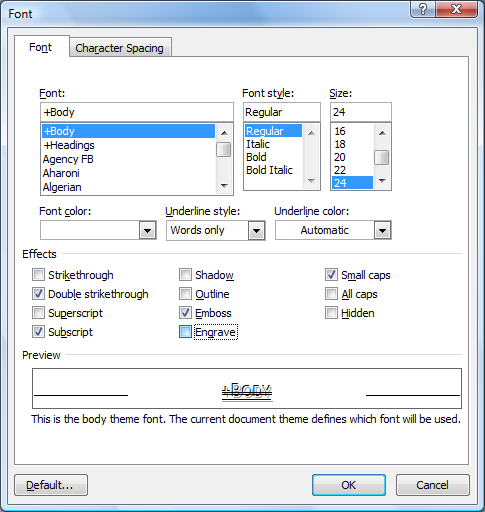
Sometimes options affect each other in ways that can’t be expressed as checkboxes (all independent) or radio buttons (select one and only one). A common example of this is the Microsoft Word dialog box for changing font properties:

Word 2007 font dialog box
Checking several of these checkboxes will cause other checkboxes to uncheck.
- Strikethrough and Double strikethrough are mutually exclusive.
- Superscript and Subscript are mutually exclusive.
- Shadow and Outline may be enabled simultaneously, but both are mutually exlusive to Emboss and Engrave.
- Emboss and Engrave are mutually exclusive to each other.
- Small caps and All caps are mutually exclusive.
The Strikethrough/Double strikethrough, Superscript/Subscript and Small caps/All caps options could have been implemented with radio buttons. Why weren’t they? Probably because each group would have needed a “Nothing” option. Each group of radio buttons would have also needed space to separate it from the other groups.
There is no simple way to show the dependencies within the Shadow/Outline/Emboss/Engrave options.
Radio button problems
The name was probably a bad start. I have never seen a real-world radio with buttons that look like computer “radio buttons”.
Checkboxes always do something when clicked ((Unless they’re disabled, but that’s a whole other problem.)). Radio buttons do not always do something when clicked. If a radio button is “on”, the only way to switch it “off” is to select one of the other options.
It is possible to have multiple groups of radio buttons on a single screen. A good designer will group them clearly, but this doesn’t always happen.
Alternatives
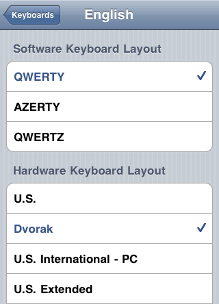
Checkboxes and radio buttons have been around for decades, but have never been fully understood. When the designers of iOS created its standard set of user interface components, they left out both checkboxes and radio buttons. Checkboxes were replaced with switches. Radio buttons were replaced with segmented controls.

Switches in iOS

Segmented control in iOS
Switches are used quite a bit. Segmented controls do an excellent job of showing that they are a group of mutually exclusive options, but don’t allow much writing to describe those options. Instead, iOS user interface designers often use a single-column table with checkmarks to show a list of mutually exclusive options.

iOS settings tables
Why do I need to know this?
User interface conventions can tell you a great deal. Learn the conventions, and you can tell what an application does before you even use it. Checkboxes and radio buttons are just two of the conventions. They are common, yet frequently mistaken for each other, causing confusion and annoyance.
Learn to recognise them and their behaviour, and you will avoid this common source of confusion.
Further reading
The people who make operating systems publish detailed guidelines for software developers. Even if you are not a developer, you may be interested to know what Apple and Microsoft think of your thought processes.
OS X Human Interface Guidelines for Checkboxes and Radio buttons
Windows User Experience Interaction Guidelines for Checkboxes and Radio buttons
Ancient History Supplement
While most checkboxes now contain ticks, this was not always the case. Windows versions up to 3.11 put used a cross instead of a tick ((Graphical User Interface Gallery – Windows, Nathan Linebeck)). This was easier to program, but was also confusing. Did the X mean “on” or “off”? Clicking on the X made it disappear, suggesting (correctly) that blank was “off” and X was “on”.
“I have never seen a real-world radio with buttons that look like computer “radio buttons.”
I have, at least in terms of functionality, on old radio, cassette players, tape recorders, etc. with (electro)mechanical buttons/switches. Have you never seen a device with a line of buttons where you can push one button down, and then if you push another one down the first one you pushed pops up (sometimes one or more of the buttons will have a spring or something in it such that you can press it down part or all the way in order to reset the toggles)? In modern times keeping track of which button was last pressed is handled by software or solid-state electronics, but back in the day such luxuries didn’t exist.
Yes, I could have phrased that better. The mutually exclusive behaviour of computer radio buttons certainly matches the mechanical buttons on old radios.
The thing I’ve never seen is a mechanical radio button with the circular appearance that has become standard on computers. Not that computer radio buttons needed to match their mechanical counterparts exactly.
Computer radio buttons may just be circular by default, for maximum contrast with square checkboxes. (So why are the checkboxes square? I’m guessing here, but we’re well used to checkboxes on paper forms being square, to easily fit a tick or cross.)
(Rather, the need to keep track of which button was last pressed isn’t really necessary when microcontrollers are involved, as interrupt/function-driven embedded software obviates that need.)